Website Design & Dev following an institutional rebrand.
160over90
Texas Tech University
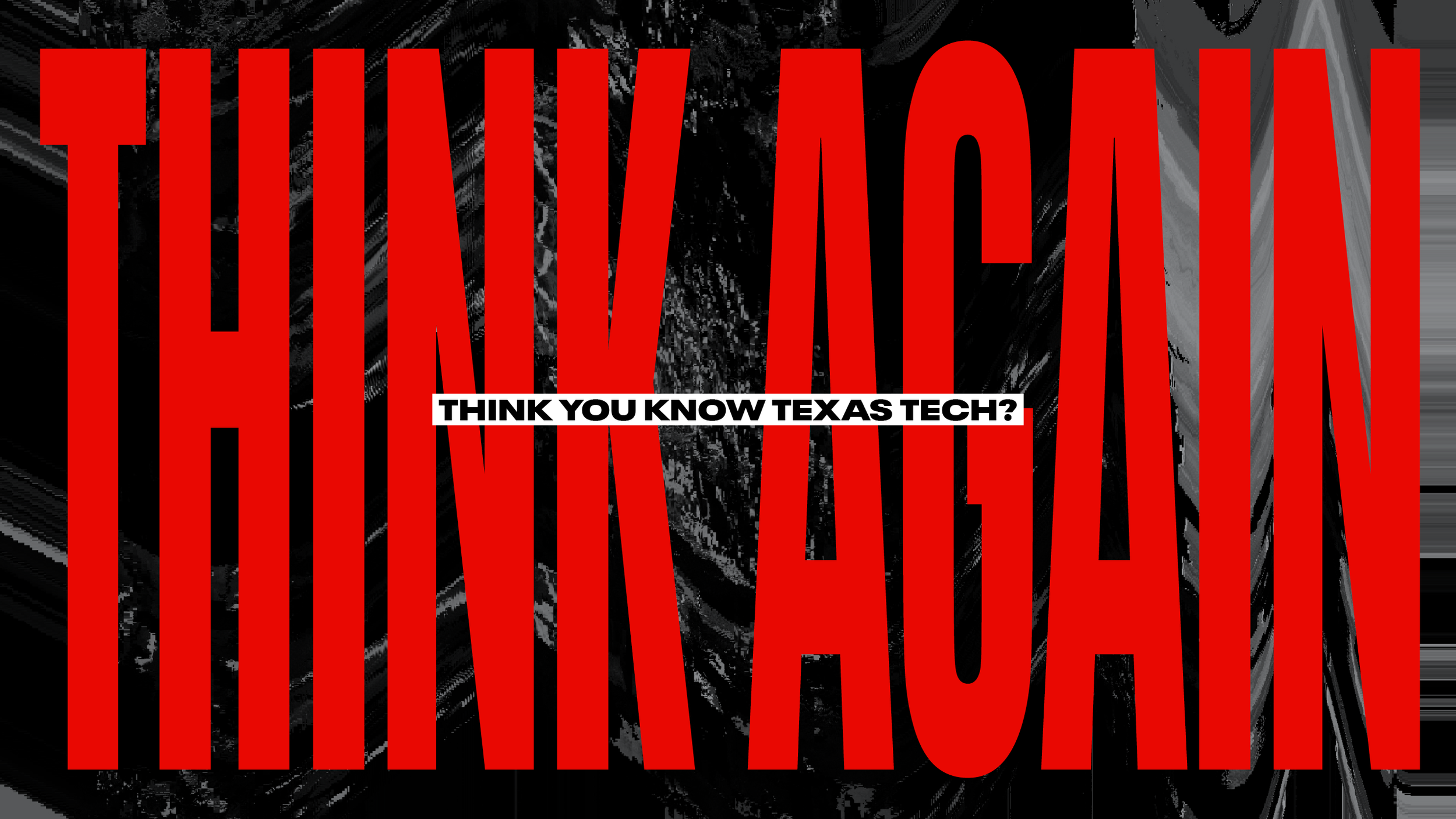
You heard ‘em.
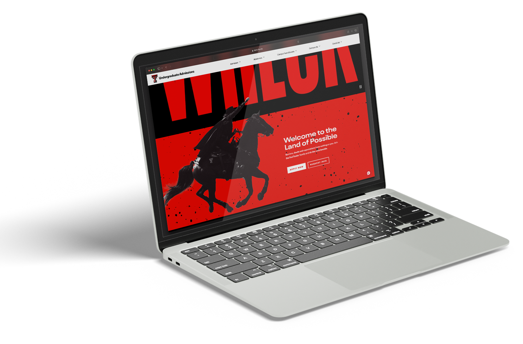
Wreck Expectations.
It’s the through line for all the institutional rebrand completed by an enormously talented team at 160over90. I can say whole-heartedly say this, because I actually had nothing to do with it. I saw stuff getting tossed around, posted on the white board, mocked up, tossed out. But I sat in the cheap seats and ooh’d and ahh’d.
When it came time to actually make the website, there was a bit of a perfect resourcing storm, and I was able to slide in and help bring the brand to life for the world wide web.
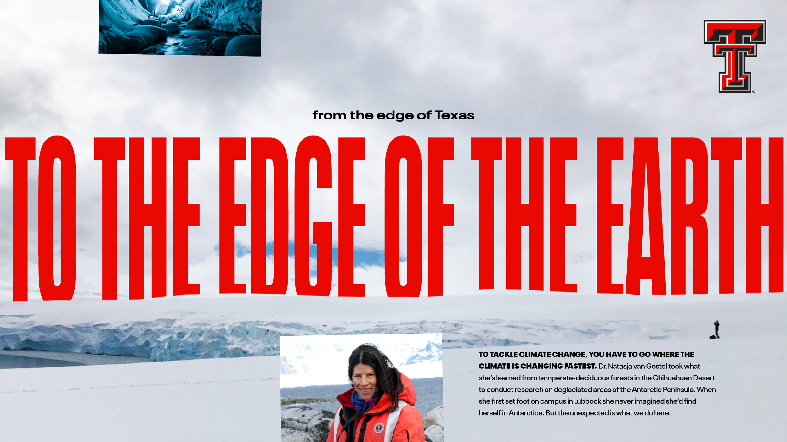
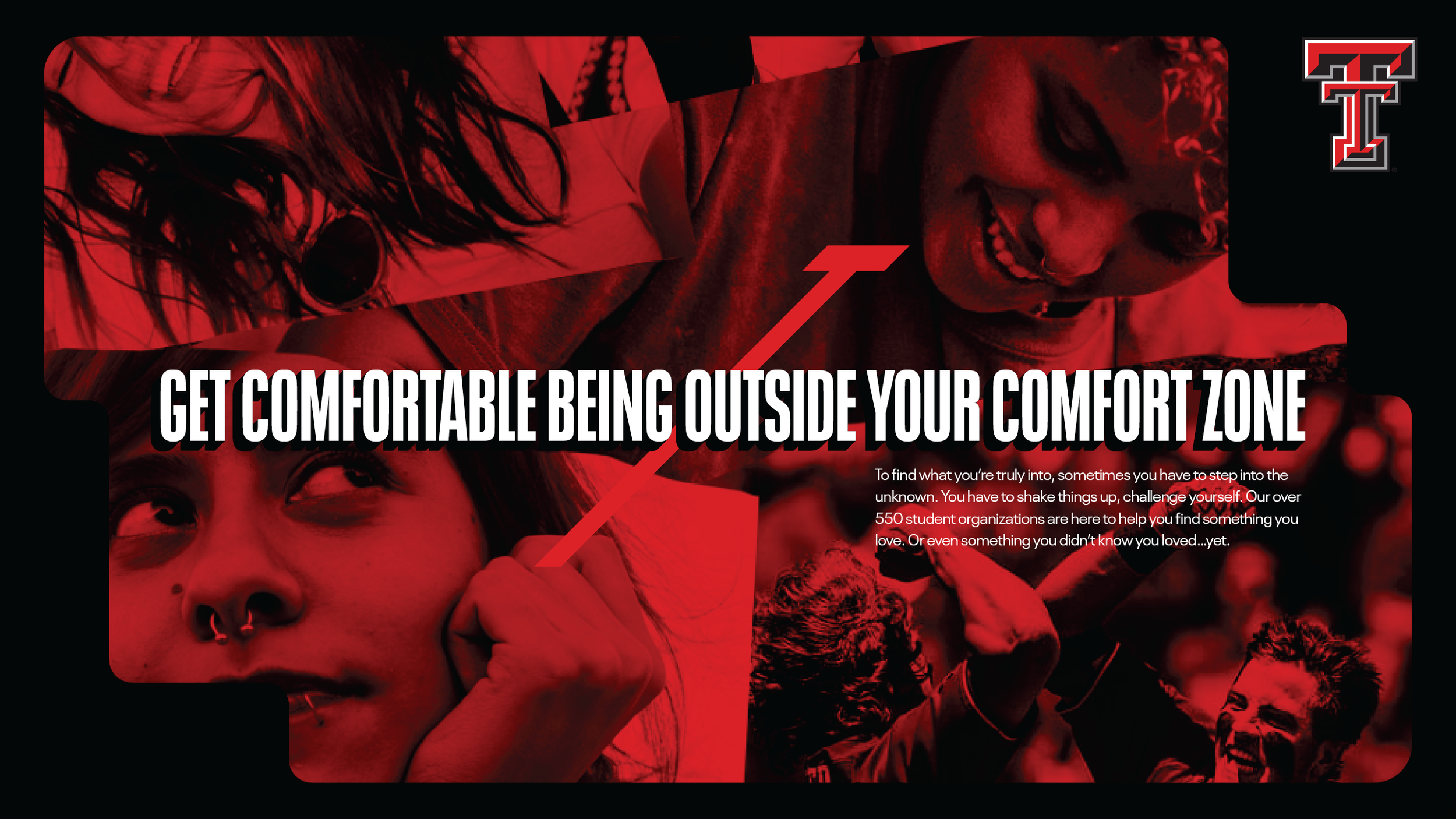
The Brand:
TTU has something to say. And while they’ve been implementing the various aspects of the new brand over time, this homepage was the first digital expression. Conveniently able to stand independently from other pages, and inspire future work and scopes to develop out the rest of the interior pages.
Audience:
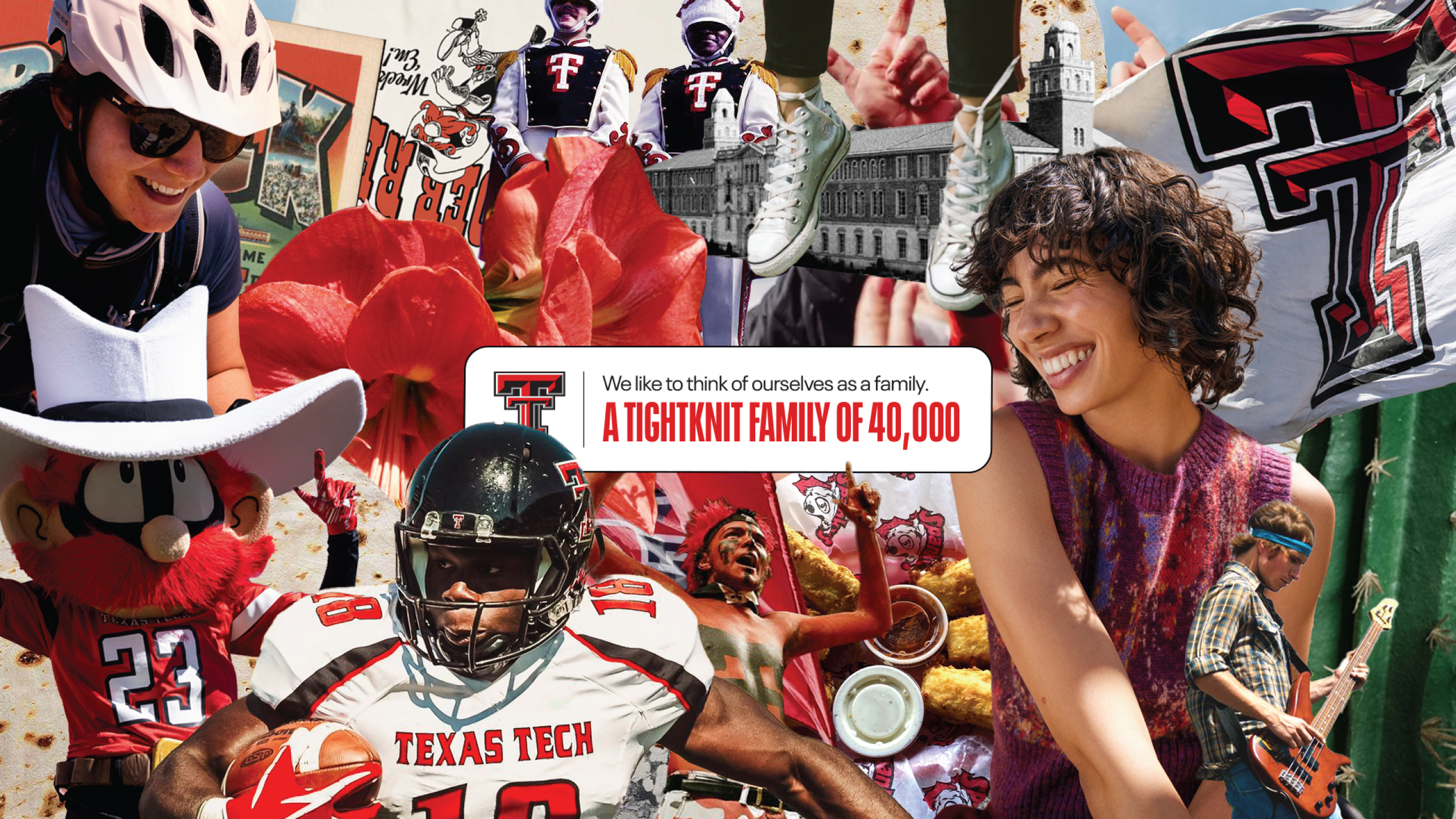
These aren’t parents masquerading as kids, quietly applying on their behalf. Nah, these kids are real. And they’re in demand.
This is an opportunity to cut through the clutter. Make an impression, and for goodness sake, be relevant.
Delight:
In case it’s not obvious, TTU doesn’t exactly splash about in the safe zone. This has a couple of Easter Eggs, with more to come later.
Little details to ensure continuity across the brand experience, such as these false drop shadows in the button hover states.
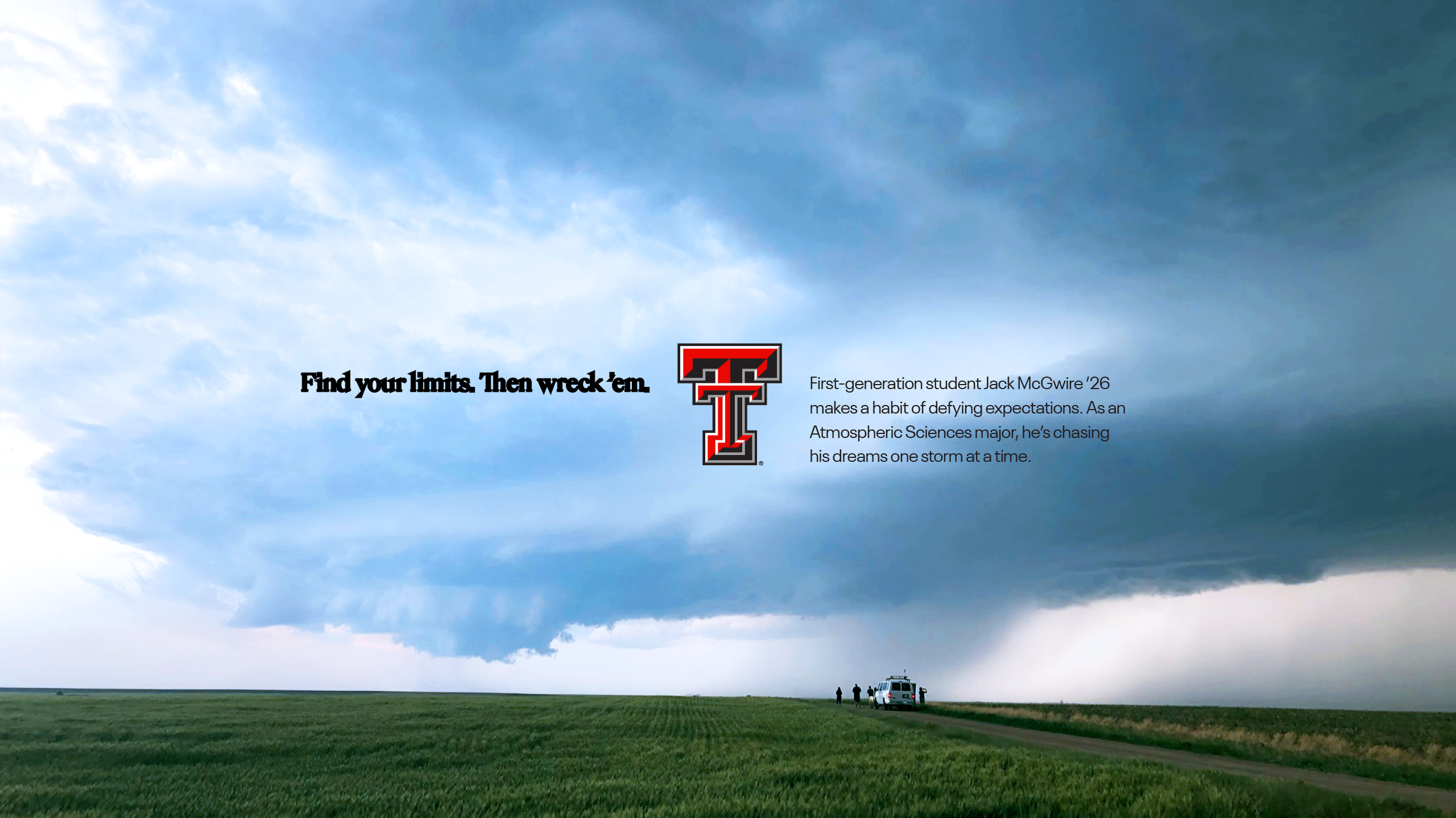
The college experience is about chasing those curiosities and embracing unexpected discoveries. And this upcoming generation of students not only desires unexpected interactions, but demands it. We took the extra step to encourage and reward exploration on the site, both in the image choices and the fun hover reveals.
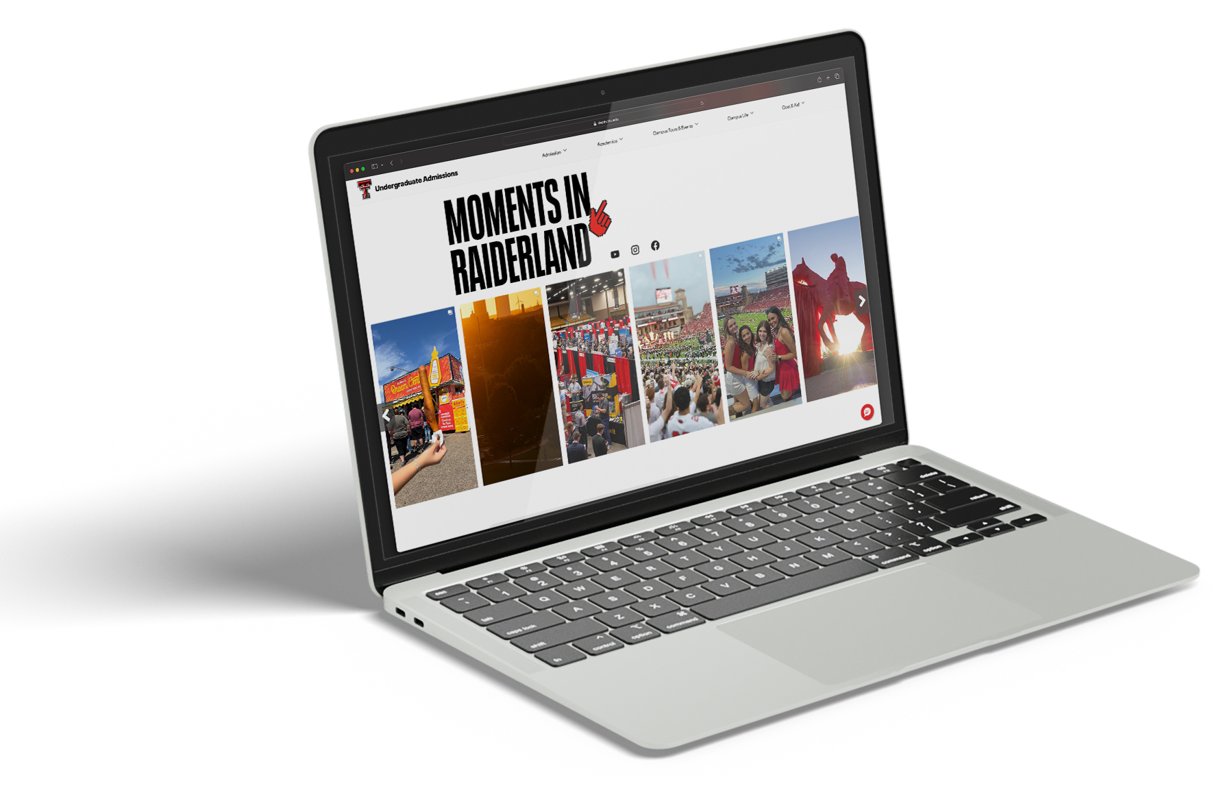
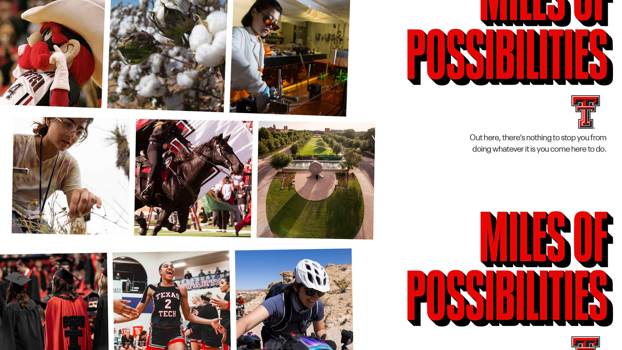
Full of fun traditions, such as the Raider Red and the Masked Raider, Texas Tech leans into the regional norms and delights. An example is the “Guns Up” gesture, beloved by students and alumni alike.

To appreciate the big Texas energy, we’ve even built in amuse-bouches to let the eye take it all in.
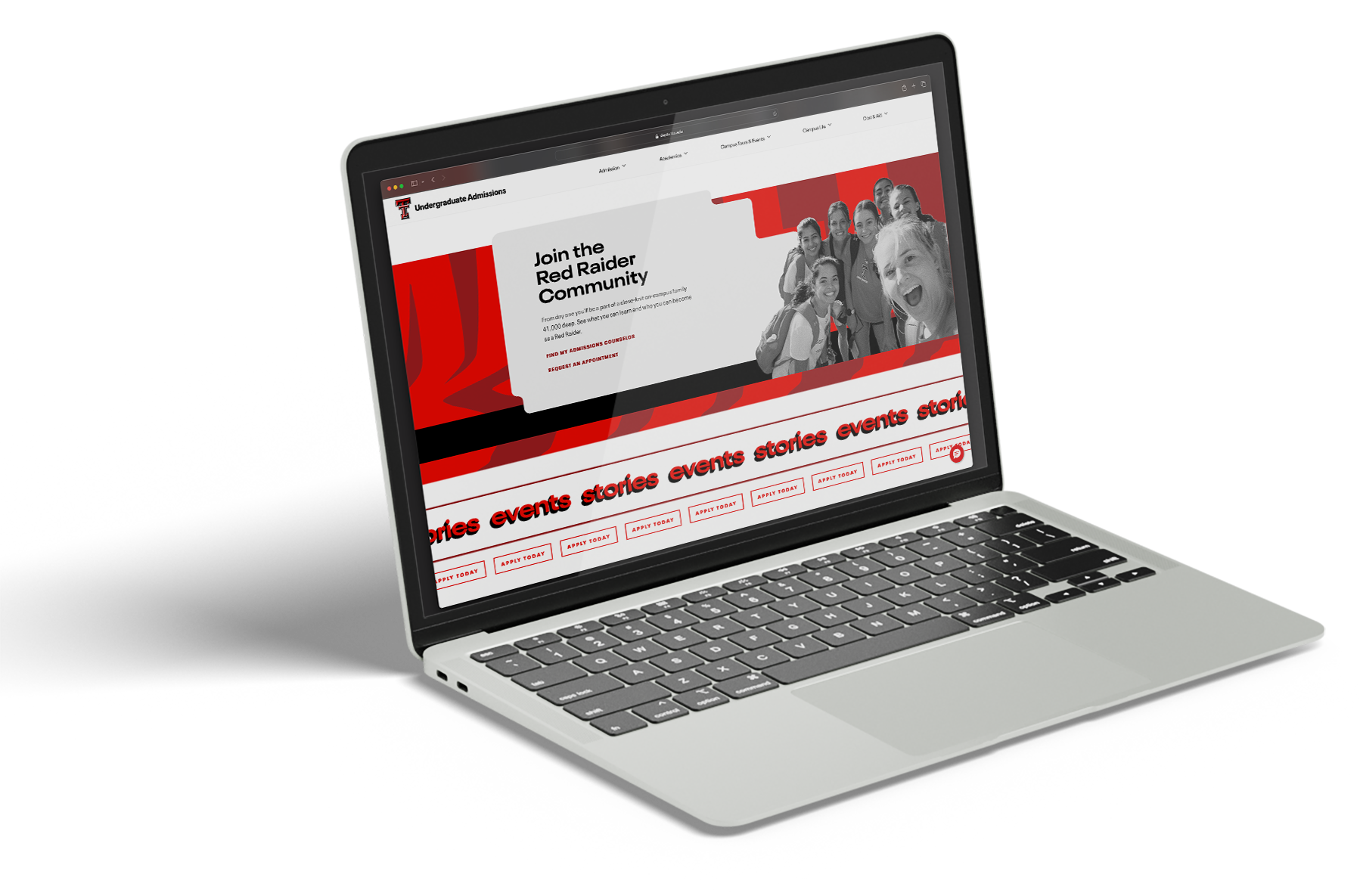
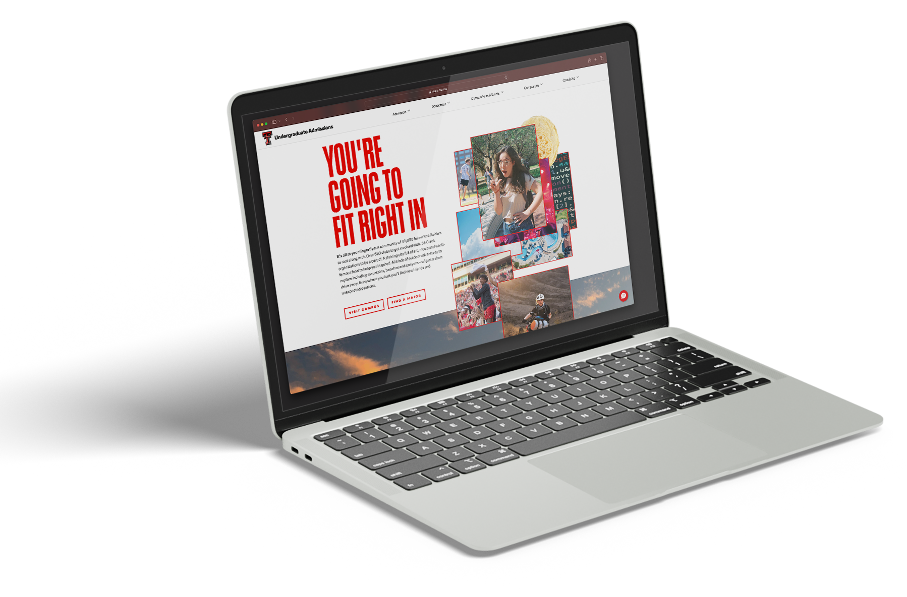
To encourage the conversation and the user journey, without putting so much visual pressure on one or two or three buttons, we brought in a stock-ticker type illustration. A choice that has hierarchical weight without being so monolithic.
And if you’ve stuck around for this long, maybe you’ll stick around for an idle browser animation that may just be the most IYKYK detail.
Credits //
Agency: 160over90
Client: Texas Tech University
Executive Creative Director: Patrick Macomber
Group Creative Director: Howard Hill
Creative Director: Stu Taylor
Lead Designer: James Snyder
Associate Creative Director: Ted Quann
Associate Creative Director (Des): Justin Spinozzi
Digital
Digital Creative Director: Rich Norton
Digital Creative Director: Juliana Lynch
UX Director: Justin Woolard